Links tagged "typography"
A beautiful typeface and one I can immediately put to use. They aimed to create "… a flat-sided sans serif that was disarming instead of brutish, one that employed confidence and subtlety instead of just raw testosterone." #
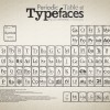
While I'm on a Type kick this morning, this Periodic Table of Typefaces is very well done. Sure, there's not much Periodic about it, but I love the attention to detail on it. Don't miss the interview with the creator as well. #
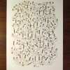
While I'm on the topic of posters, this is a beautifully designed alphabet. Each character has a great feel, and an obvious attention to detail. #
Kevin Cornell delves into the creation process of the typeface Phaeton, to which I linked almost a week ago. Still can't seem to break away from this typeface. Maybe I should just break down and buy it, instead of drool over it. #

A great unique typeface. Although I don't have an immediate project where I could use this, I can think of several applications. #
2009.06.19
Miso
A (free) delightful compact typeface, with small touches of roundness in the right places. I've been looking for something like this. #
Another nice free font. I particularly like the numbers and ampersand, though it has an appealing feel overall. #
While I'm on the note of typefaces, I particularly enjoyed two of the typefaces presented in this review - Calgary Script, as well as Dolce Thin and Dyna (technically two different typefaces). All three I can see as wonderful highlights to a piece of work, with the latter two being a bit more liberal and potentially interchangeable. Slick #
I really like this new free typeface. Vegur feels like it has a wider aperture, maybe encouraging a lighter feel than the standard sans-serif fonts. As an added bonus, I like how the dots to the lowercase i's and j's are rounded as opposed to squared. I'm no pro on this stuff, but it's fun to compare. The lightest version is my favorite. #
Just in case I wanted to lose myself for a chunk of time at the computer... #