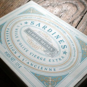
2011.01.17 Albert Menes Sardines

I love the detail on this package of sardines (scroll about a third of the way down on the linked page). Feels like a nice balance between busy details and white space. Although the company's site is in French, and you can't see any of their products close-up, it's clear that their whole line of seafood/fish products are designed in a similar way.
Via TheDieline.com
Tag(s): design inspiration