Links tagged "design"

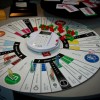
I enjoy the game, though I hardly ever play it because it tends to put people in a bad mood. In this circular design for their 75th anniversary, I think the larger (former corner) spaces on the board will help certain sides or stretches of the board to be easily recognized. Not sure how I feel about the digital banker. #

Site of a new (to me) designer and illustrator, Darren Drew. I particularly like the retro, yet approachable feel to his work. It makes me want to try to make something like that. File this under inspiring. #

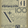
Ross Berens has created a beautiful set of posters about our solar system. I particularly like the typesetting on these. They have a retro, but not quite retro feel to them. Just lovely. #

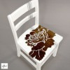
The first Before & After on Design Sponge that I've liked in a while (the chair, not the room). Similar to the reviewer, I like how the designer, Will Mean, lets the wood grain show through the paint. If I could change anything about it, I would alter the racing stripe a little... but I don't know how. #

Brilliant work by an illustrator/designer that is completely new to me - Jessica Hische. I love her work, especially her hand-lettering, which is her self-proclaimed specialty. I can clearly see why. What a fabulous find for the day.
Update: I'm such a space cadet, that I forgot I've already linked to her. At least the other was on her blog (which isn't super-obviously linked to from her portfolio). I'm also glad that I'm consistent in my linkage - previously it was her typography that grabbed me, and it still is. #

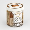
I love this cookie dough packaging design. It has a great layout and a clean design (despite the amount of content that seems to be on there). Very slick. #

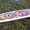
I'm diggin' these surfboard designs. Maybe it's all the geometry, or the slick colors, or that natural wood fin… whatever it is, I like 'em. #

Besides looking delicious, these pretzels have a fabulously designed label as well. They contribute to the "hand-crafted" message of the product, and have a nice artisan feel to them. Now if only I could get some of those pretzels... #

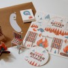
I love the illustrations, colors, and concept behind this self-promotion of Swink. They have great colors, simple message, and I love the fact that you can pop them out and build stuff. The whole camping/campfire motif reminds me of a previously linked-to Coleman concept piece. #
I can enjoy houndstooth as well, though I'm not obsessed with it. Anything that has such a cool name probably deserves some level of attention. I think the wallpaper would be cool to have on a small wall (because it would probably make my eyes bleed on a huge wall), though $85 for a single roll is… excessive. #
