2010.10.23 IBM 'Outcomes' Campaign
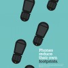
Clever double-meaning ads by the Dutch Uncle Agency. What's better is that it isn't just once, but multiple times. Very cool use of negative space. #

Clever double-meaning ads by the Dutch Uncle Agency. What's better is that it isn't just once, but multiple times. Very cool use of negative space. #
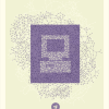
Bernard Barry made some great posters that fit very well into the desired message of the recent f8 Conference. I'm not much of a fan of Facebook, but his incorporation of chaotic and organized elements is extremely well-balanced. I love these. #
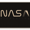
A straight-forward and perfect approach to a redesigned NASA logo and concept. Don't miss my preferred NASA II logo of his as well. #
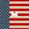
I've already set the first one there as my desktop background (and I bought a whole mess of fireworks yesterday as well). Next stop? Tear-up when listening to the star spangled banner. #
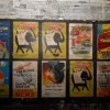
The tube station at Notting Hill underwent renovation in/around 1956-1959. During the process they sealed off a portion of the passageways, and left things as they were, including this set of advertisements on the walls, which were only recently discovered. #
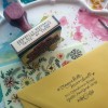
Need a beautiful, customized return address stamp? This should be your choice. Hand-drawn calligraphy, converted into a rubber stamp for your convenience (or if you're so inclined, get one for each of your wedding guests, or other options). Very cool. #
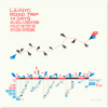
Interesting how you can turn something so mundane into something cool. I should document my next road trip, but I'll spare you the view of 8 hours of desert. #
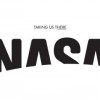
A proposed logo change for our favorite space agency. Seems far more adaptable than their current logo, and not so outdated. #
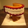
Although my wife would never allow it, I think it'd be awesome to have this chair in my front room. Very, very cool. #
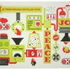
I love custom-made cards - birthdays, holidays, whatever. I think they have a bit more style and awesomeness in them. In this particular case, each of the members of this design team have created their own. Although each card is different, they carry a similar-ish theme (and color palette). I feel like I should start working now on my card for this year. #
design geekingout inspiration ma.gnolia reference web2.0 clothing DIY people wantit print css typography infographics maps food foodforthought humor kids wanttoseeit toys photos recipes webgeek work language games timekiller illustration vintage music flickr cut-outs books spanish webdesign rubyonrails google mac art figurines sports photography flash movies afk posters origami lego videogames entertainment unfortunate currentevents surf beatles iphone computer flyers AFK writing quote datanerd diy 3dprinting churchofjesuschristoflatterdaysaints