2010.12.08 "Ten Great Years" Art Print by Max Dalton
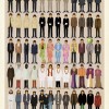
I'd thoroughly enjoy one of these prints. Ideally it'd be framed, but I could go without. I can already see where it'd be hung. #

I'd thoroughly enjoy one of these prints. Ideally it'd be framed, but I could go without. I can already see where it'd be hung. #
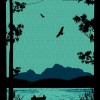
I'm not sure why I didn't link to this when I originally saw it (9 months ago). I really like this print, and have fond memories of going fishing early in the morning with my father. Although the print has different plants than are ever near the alpine treeline (where I'm used to fishing), it's still a nice print. #
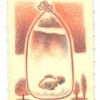
For whatever reason I really like this tiny little print. Comes on a 4x6, but weighs in at 1.25"x1.75". For $5, I'd still buy it, or hope somebody buys it for me for Christmas <hint, hint> #
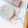
I thought this was a really good idea (and not too complicated). Carve/cut your own stamps out of block linoleum. Still has a nice personal touch. #
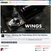
I particularly like these notebooks (Field Notes), and I'm fascinated by the printing process. Although it's not as detailed as I'd like it to be (I could spend hours/days at a printing press, just learning how it all works), it's still pretty cool. #
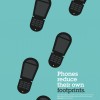
Clever double-meaning ads by the Dutch Uncle Agency. What's better is that it isn't just once, but multiple times. Very cool use of negative space. #
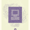
Bernard Barry made some great posters that fit very well into the desired message of the recent f8 Conference. I'm not much of a fan of Facebook, but his incorporation of chaotic and organized elements is extremely well-balanced. I love these. #
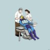
If I were a dentist, I'd buy this, and put this in my office. #
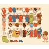
At Galleries 1988 a new Glen Brogan print is being made - one that will appeal to the Mario fan in all of us. I might just need to purchase this when it gets released. #
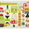
I love custom-made cards - birthdays, holidays, whatever. I think they have a bit more style and awesomeness in them. In this particular case, each of the members of this design team have created their own. Although each card is different, they carry a similar-ish theme (and color palette). I feel like I should start working now on my card for this year. #
design geekingout inspiration ma.gnolia reference web2.0 clothing DIY people wantit print css typography infographics maps food foodforthought humor kids wanttoseeit toys photos recipes webgeek work language games timekiller illustration vintage music flickr cut-outs books spanish webdesign rubyonrails google mac art figurines sports photography flash movies afk posters origami lego videogames entertainment unfortunate currentevents surf beatles iphone computer flyers AFK writing quote datanerd diy 3dprinting churchofjesuschristoflatterdaysaints