Links tagged "design"

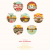
I'm not a devout fan of Wes Anderson's films, but I've enjoyed those that I've seen, and I like the feel of each of them. As you might guess, I really like the design of this poster, and the insight into the design process. #

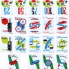
An interesting view into the historic design of Mille Bornes - a fabulous game I've always enjoyed. Growing up, we had the 1971 version in my home, which sported the 1960 card design. I'm intrigued by the “edition spécial”, but no matter which version we play, I'm most certainly going to try to Coup fourré you. #

Kind of similar to Record Envelope, except for the actual album covers themselves. I love this collection, and already see lots that I'd happily use as inspiration. #

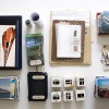
An impressive "encapsulation of [his] father's life, as communicated by the calendars, slides and other artifacts in [his] possession." He shows the original items in this Flickr photo, but has turned it into something more. I'd personally enjoy a mix of the designs and stats he's shown, along with scans and transcriptions of the actual items, in order to tell a more complete or comprehensive story (though it's probably a bit too personal to share in such a way with the entire interwebs). Either way, impressive work. #

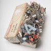
I like this collection of photos of the focal point of any deck of cards - the Ace of Spades. It'd be nice if the pictures were closer of the individual cards (and if their site weren't so appallingly slow). #

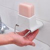
I despise soggy bars of soap, especially those intended for hand-washing. Apart from liquid soap (about which I have separate complaints), this is a great solution. Too bad it doesn't appear to be sold anywhere. #

I saved this link back when it was originally posted (in June 2009), but never posted it. I thought the 3-D paper collages by Sarah Bridgland was very cool. I love the colors she uses, and the focus on type. She clearly has a great eye. Check out Sarah's Flickr stream for further proof. #

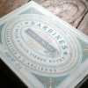
I love the detail on this package of sardines (scroll about a third of the way down on the linked page). Feels like a nice balance between busy details and white space. Although the company's site is in French, and you can't see any of their products close-up, it's clear that their whole line of seafood/fish products are designed in a similar way. #

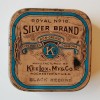
I love this set of vintage typewriter ribbon tins. I'd be a complete sucker to start collecting something like these. #

One of my early blog posts was about a product similar to this. Tapi seems like it would have troubles on the vast majority of faucets in my home, but Jokari (the company who makes the original gadget I blogged about) doesn't look as nice or function as well. Either way, these types of things are a dream to have. #
